
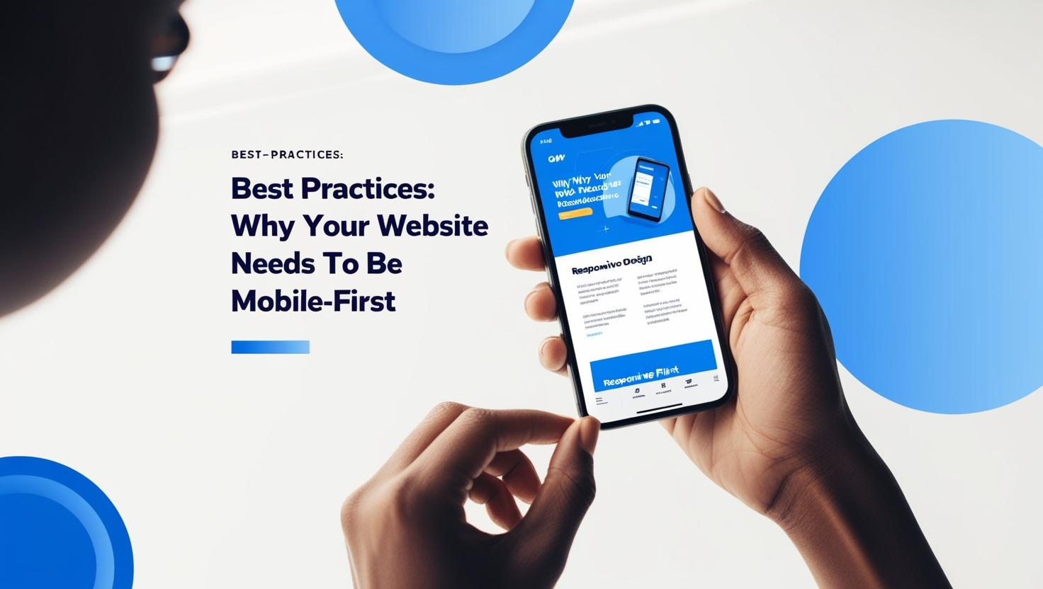
Best Practices: In 2025, the mobile internet experience is no longer a secondary consideration—it’s the primary mode of browsing for the vast majority of users. Whether you’re running a small business or a global enterprise, having a website optimized for mobile is essential for success. Google now prioritizes mobile-friendly websites in search rankings, and with mobile usage continually on the rise, a mobile-first approach is no longer optional—it’s a requirement.
Here’s why your website needs to be mobile-first, and the best practices for ensuring it performs optimally across devices.
1. Mobile Traffic Is Dominating
Recent studies show that over 60% of all web traffic comes from mobile devices. For many businesses, mobile users make up the majority of their audience. If your website isn’t mobile-optimized, you could lose out on many potential customers. Whether it’s checking emails, browsing social media, or shopping online, people spend more time on their phones than on desktop computers.
The message is clear: If your website isn’t mobile-first, you risk missing out on a massive chunk of your audience.
2. Google’s Mobile-First Indexing
Since 2018, Google has been indexing and ranking websites based on their mobile version rather than their desktop version. This means that if your site isn’t optimized for mobile, it could significantly impact your search engine ranking. With mobile-first indexing, Google assumes that your mobile site is the primary version, and a poorly optimized mobile site can hurt your overall visibility.
Best Practice: Ensure that your mobile site has the same content and structure as your desktop site. Your mobile site should be easy to crawl, with all critical elements (like titles, meta descriptions, and images) optimized for mobile-first indexing.
3. Enhanced User Experience and Engagement
Mobile users expect a seamless, fast, and enjoyable browsing experience. If your website isn’t mobile-optimized, visitors will quickly get frustrated with slow load times, small text, or images that don’t adjust to different screen sizes. This poor experience can increase bounce rates and decrease the likelihood of visitors converting into customers.
Best Practice: Focus on creating a simple, intuitive design with a responsive layout that adjusts seamlessly to any screen size. Ensure that your text is readable, buttons are easy to click, and forms are simple to complete on mobile devices.
4. Mobile-Friendly Design Drives Conversions
When your website is mobile-friendly, it increases the likelihood that mobile users will follow through on desired actions, whether that’s making a purchase, signing up for a newsletter, or getting in touch with your team. If the mobile experience is frustrating, users will abandon their tasks, and you’ll lose potential sales or leads.
Best Practice: Use large, easily tappable buttons, simplify forms, and make sure your CTAs (Call to Actions) are easy to spot on mobile. You may also consider implementing one-click payment options or other mobile-centric features like location-based services for local businesses.
5. Faster Load Times Equals Better Performance
One of the biggest challenges with mobile websites is ensuring fast load times. Mobile users expect pages to load quickly, and if a site takes more than a few seconds to load, they will likely move on to another option. Google’s algorithm also takes load speed into account when ranking sites.
Best Practice: Use modern techniques to optimize images, enable caching, and choose lightweight mobile frameworks that ensure fast load times. Tools like Google PageSpeed Insights can help you test and improve your site’s performance.
6. Increased Mobile E-Commerce Sales
Mobile commerce (m-commerce) is growing rapidly, with more and more people making purchases directly from their smartphones. In 2025, it’s expected that mobile sales will make up nearly 75% of total e-commerce sales. If you’re running an online store, it’s crucial to have a mobile-optimized site that facilitates easy shopping on the go.
Best Practice: Ensure that your mobile e-commerce site is streamlined, with easy navigation, quick product searches, and a simple checkout process. Offering mobile payment options, like Apple Pay or Google Wallet, can also help increase conversions.
7. The Role of Progressive Web Apps (PWAs)
Progressive Web Apps (PWAs) are an emerging trend that combines the best features of mobile apps and websites. PWAs are fast, reliable, and work across all devices, offering offline capabilities and push notifications. For businesses looking to stay ahead of the curve, PWAs are an excellent way to provide users with an app-like experience on the mobile web.
Best Practice: If you want to offer a seamless mobile experience, consider implementing a PWA. They can be a cost-effective alternative to developing a full native mobile app and can enhance user engagement on mobile devices.
Conclusion: Mobile-First Isn’t Just a Trend—It’s the Future
The mobile-first approach is now the standard, and businesses that fail to optimize for mobile risk falling behind. With mobile usage continuing to rise and Google’s mobile-first indexing in place, optimizing your website for mobile is critical for both user experience and search engine rankings.
At GetMorc, we specialize in creating mobile-first websites that not only look great but also perform seamlessly across all devices. Whether you need a simple website redesign or a fully optimized mobile experience, we’re here to help your business stay ahead of the competition. Reach out to us today to make your website mobile-friendly and ready for 2025!


